《相观——南京平面设计联盟成立二十周年》
Mutual Observation and Learning
The 20th Anniversary of Nanjing Graphic Designer Alliance
开本:250mm×340mm×13mm
重量:714g
时间:2018年
客户:南京平面设计联盟
Size: 250mm×340mm×13mm
Weight: 714g
Year: 2018
Client: Nanjing Graphic Design Alliance
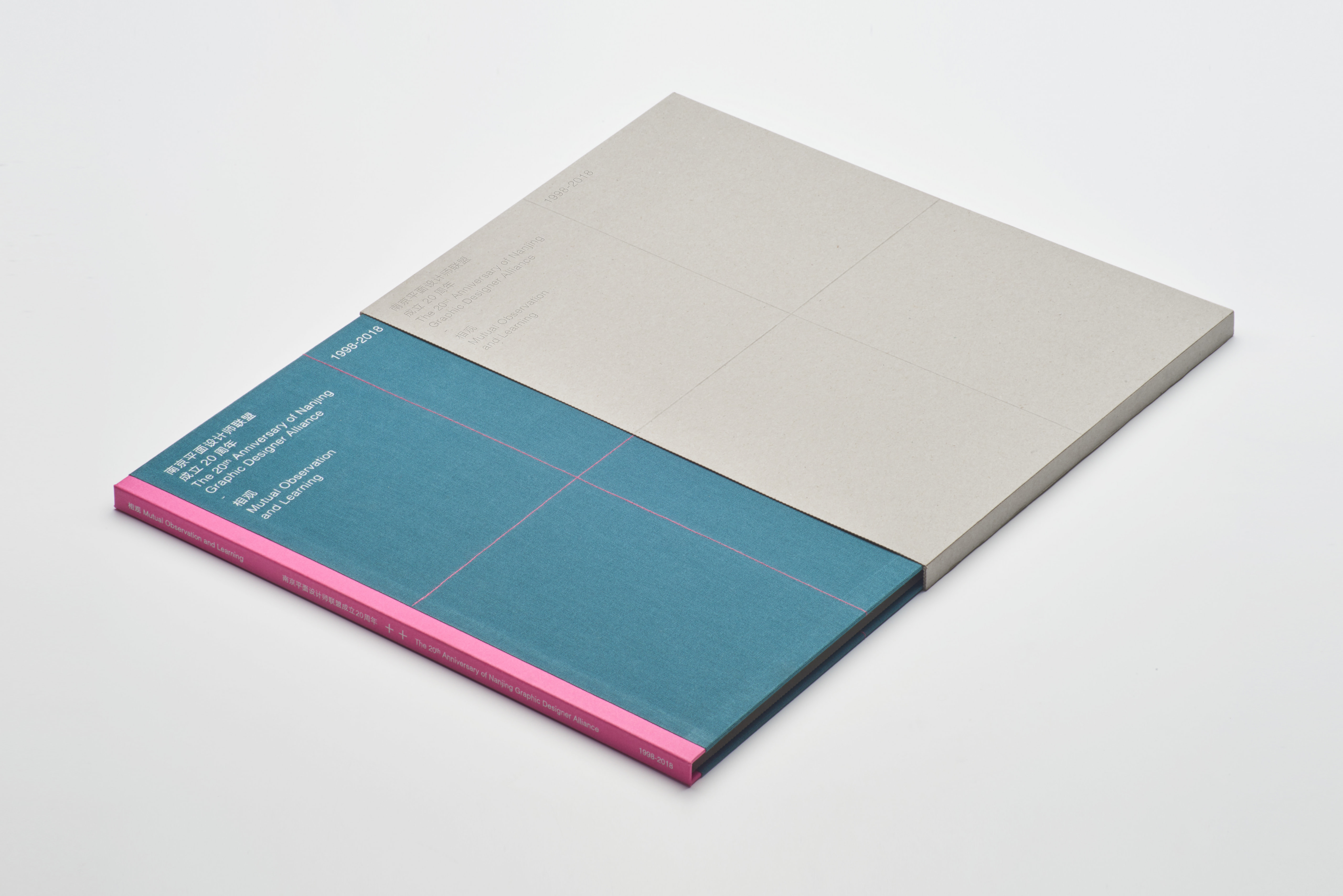
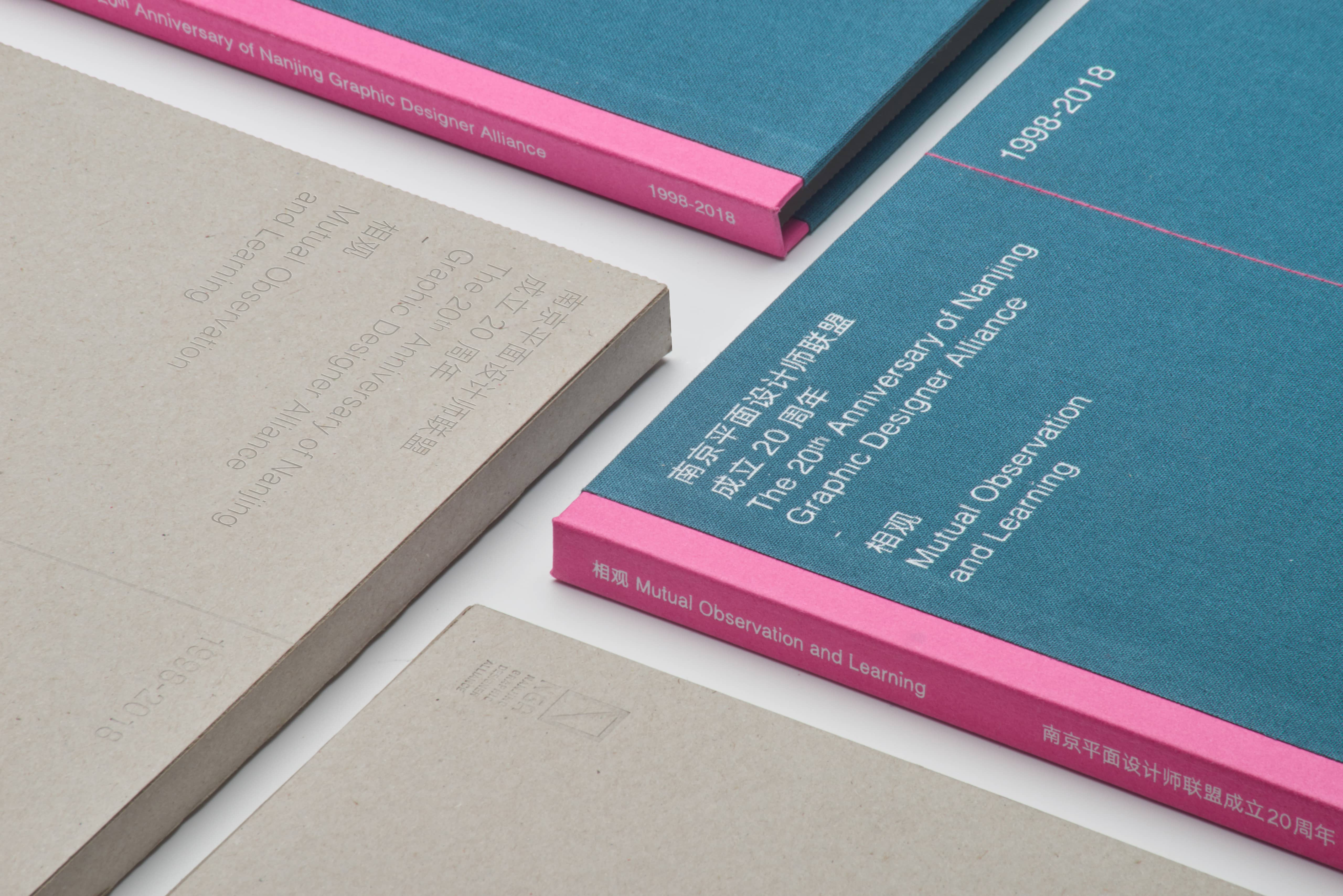
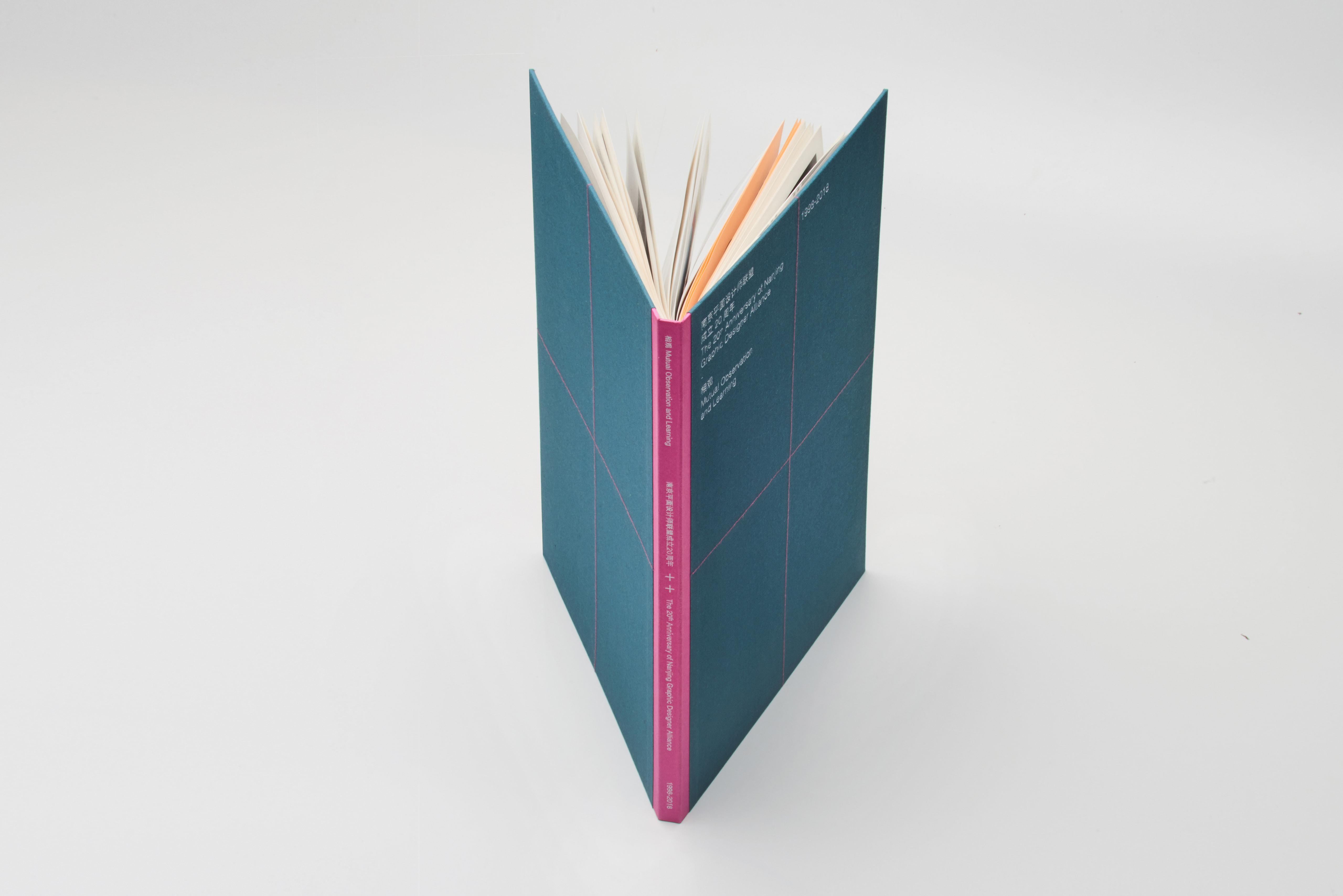
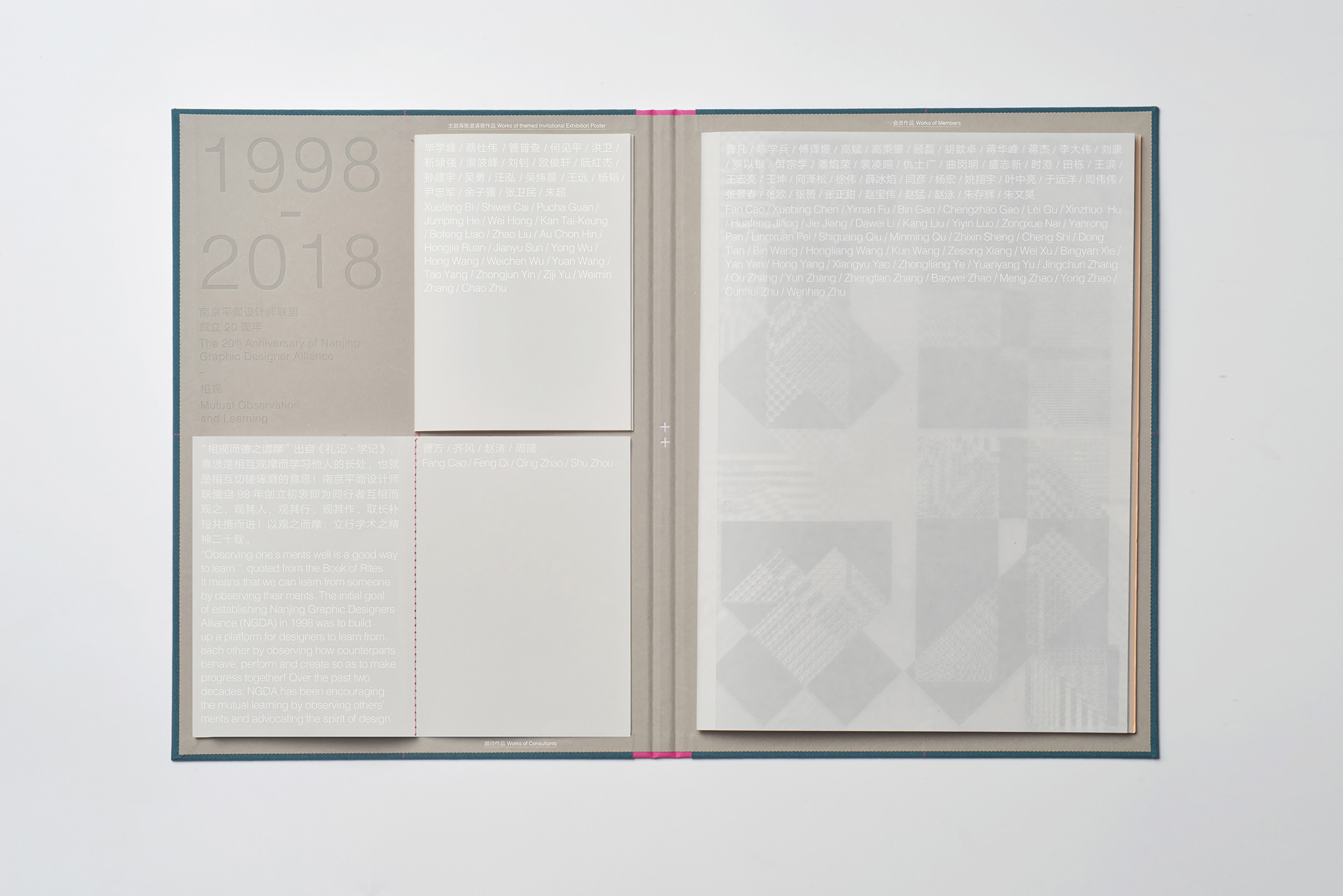
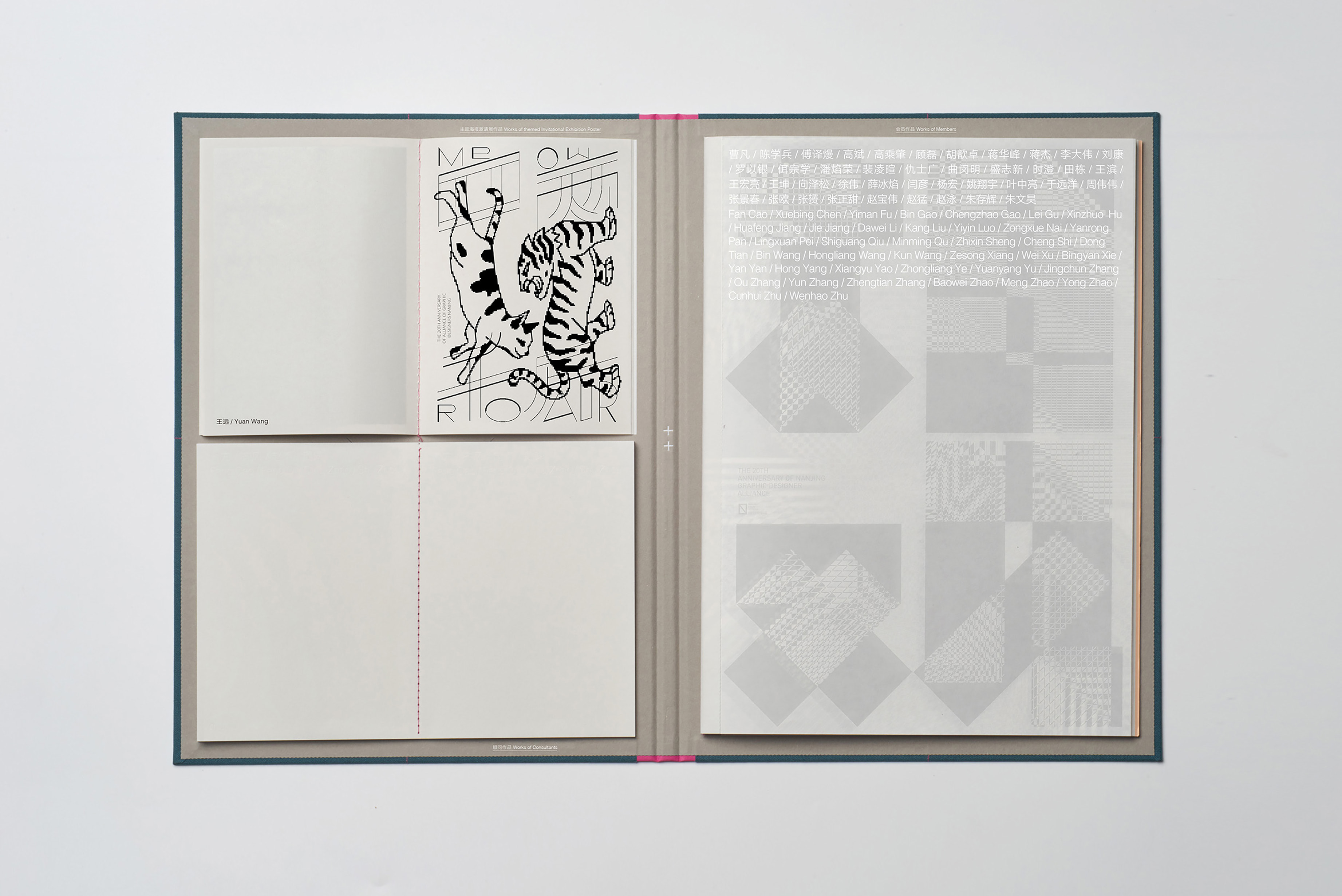
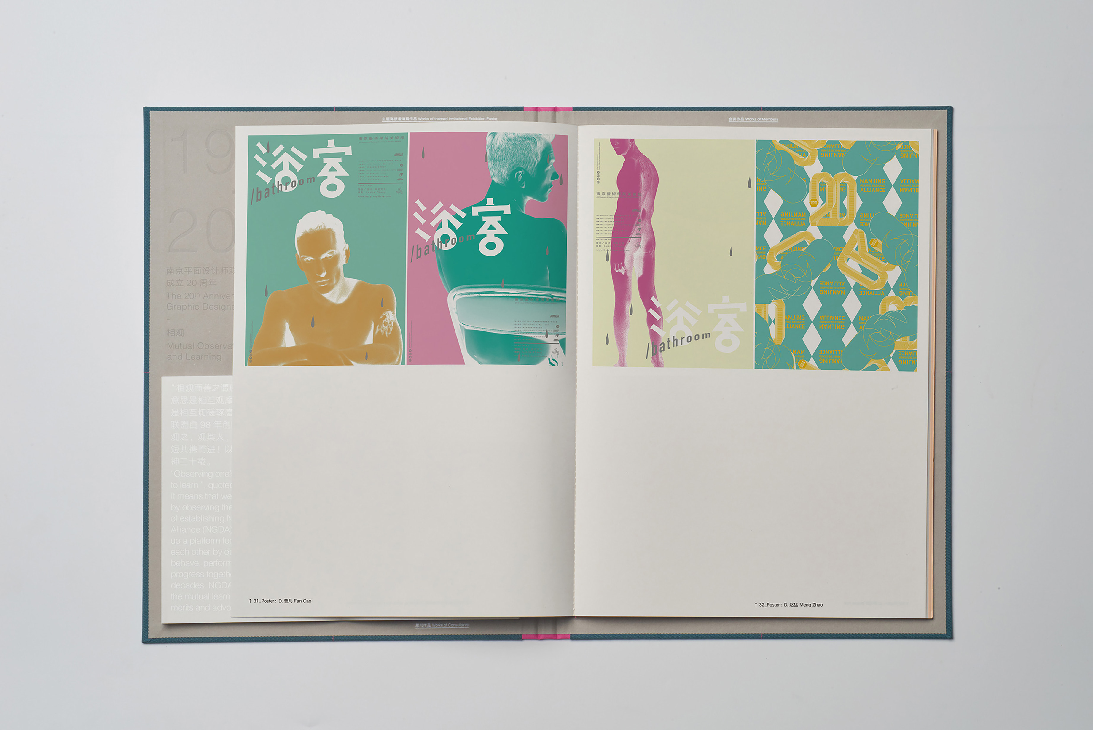
南京平面设计联盟成立20周年展览设计的限量版画册,“十十”是中国汉字表达20之意,以这个简约的结构展开设计。内容分为三大部分:主题海报邀请展作品、顾问作品、会员作品。通过理性的编排方式,让各部分内容合理有序地在有限的空间里得到展示。灰色(城墙)、玫红色(梅花)、绿色(人文绿都)是对南京城市的诠释。
This is a limited-edition catalogue designed for the 20th anniversary of Nanjing Graphic Designer Alliance. The design is based on a simple graphic (十十) consisting of two Chinese characters “Shi Shi”, meaning 20. The content is divided into three parts, namely, works of theme poster invitation exhibitions, works of consultants and works of members. Each part of the content is well displayed in limited pages through rational layout design. The binding form breaks the tradition while both the paper and craftmanship are so exquisite that one could hardly bear to take hands off it. Gray (city wall), rose red (plum), green (human green) are interpretations of Nanjing city.
整体书籍形式突破了传统作品集的设计方式,这是由作品内容所决定的。在日常的设计中,我们总是寻思着什么样的设计是“好设计”。作为设计师,我们应该“聆听”设计项目本身,从内容里寻找设计的方向,解决方案往往隐藏在内容中,这本作品集就是最好的佐证。在印刷和装订技术的可能范围内,不断寻找针对该书籍主题所特有的东西,造就了这本书的独一无二。
The overall design of this book breaks away from the traditional format of a portfolio, a decision shaped by the content itself. In our daily design work, we are constantly pondering what makes a “good design.” As designers, we should “listen” to the design projects themselves, seeking direction from the content, as the solutions are often hidden within them. This portfolio serves as the best evidence of that approach. By exploring the possibilities within printing and binding techniques, we have continuously sought elements unique to the theme of this book, resulting in a truly one-of-a-kind publication.
