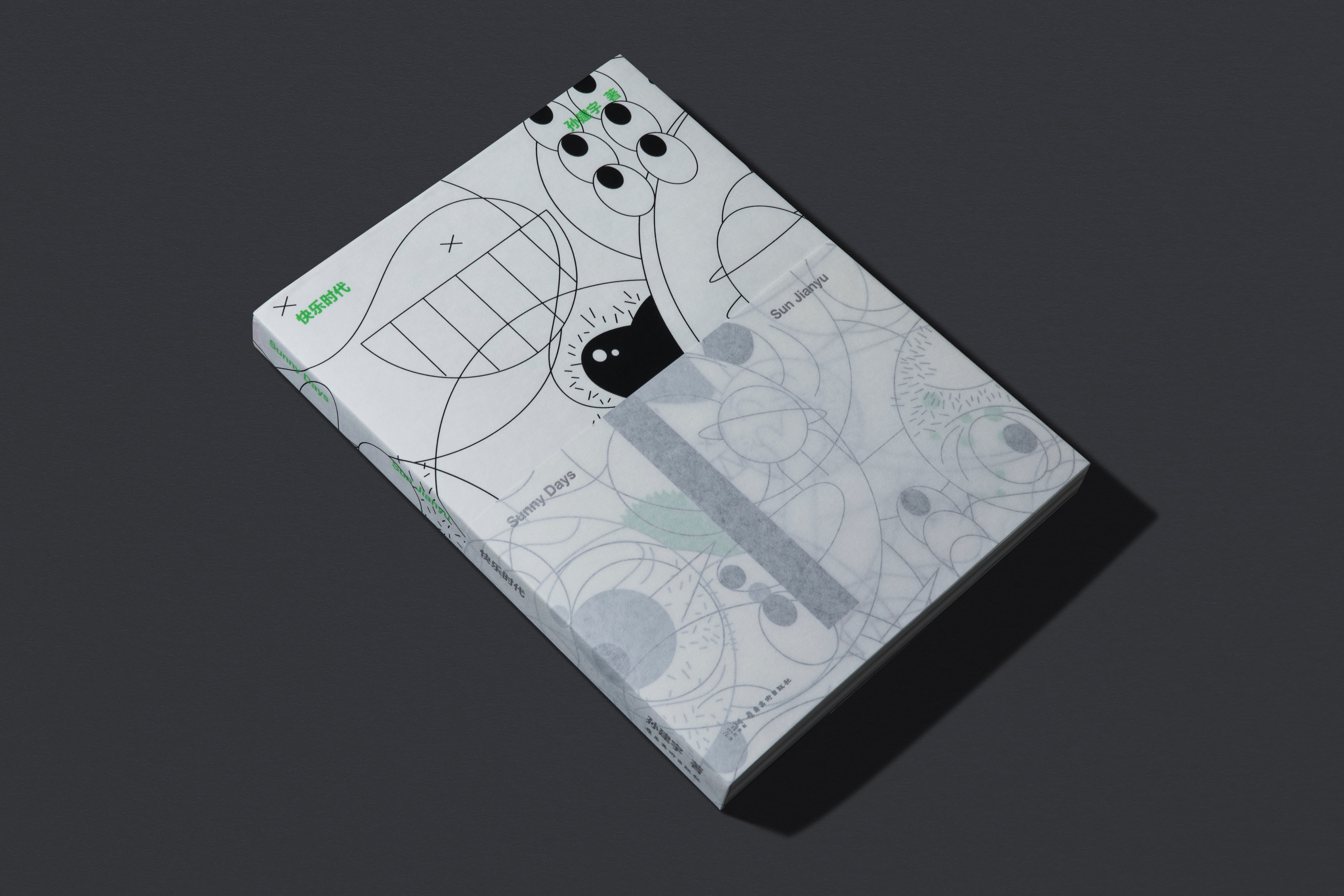
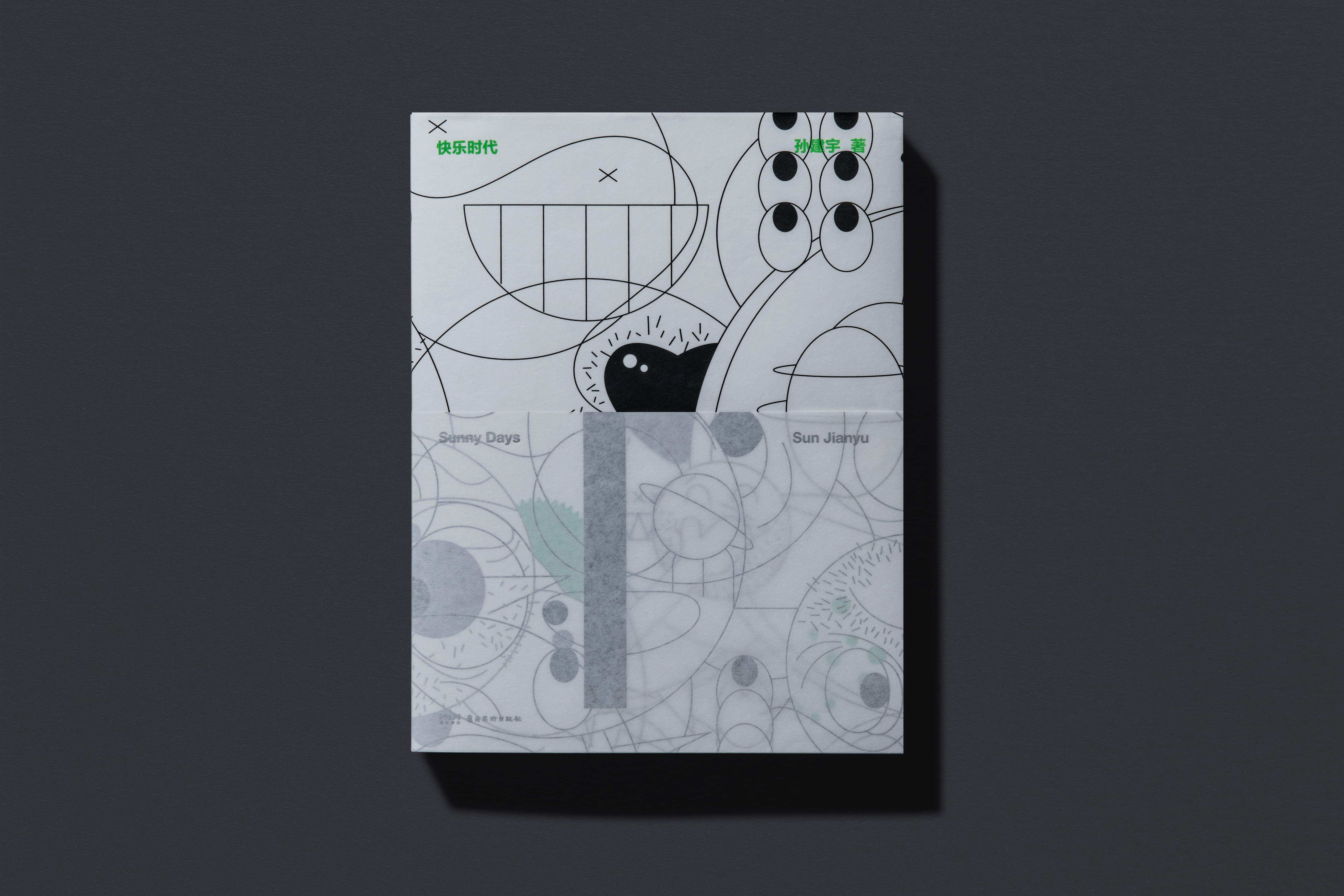
《快乐时代》
Sunny Days
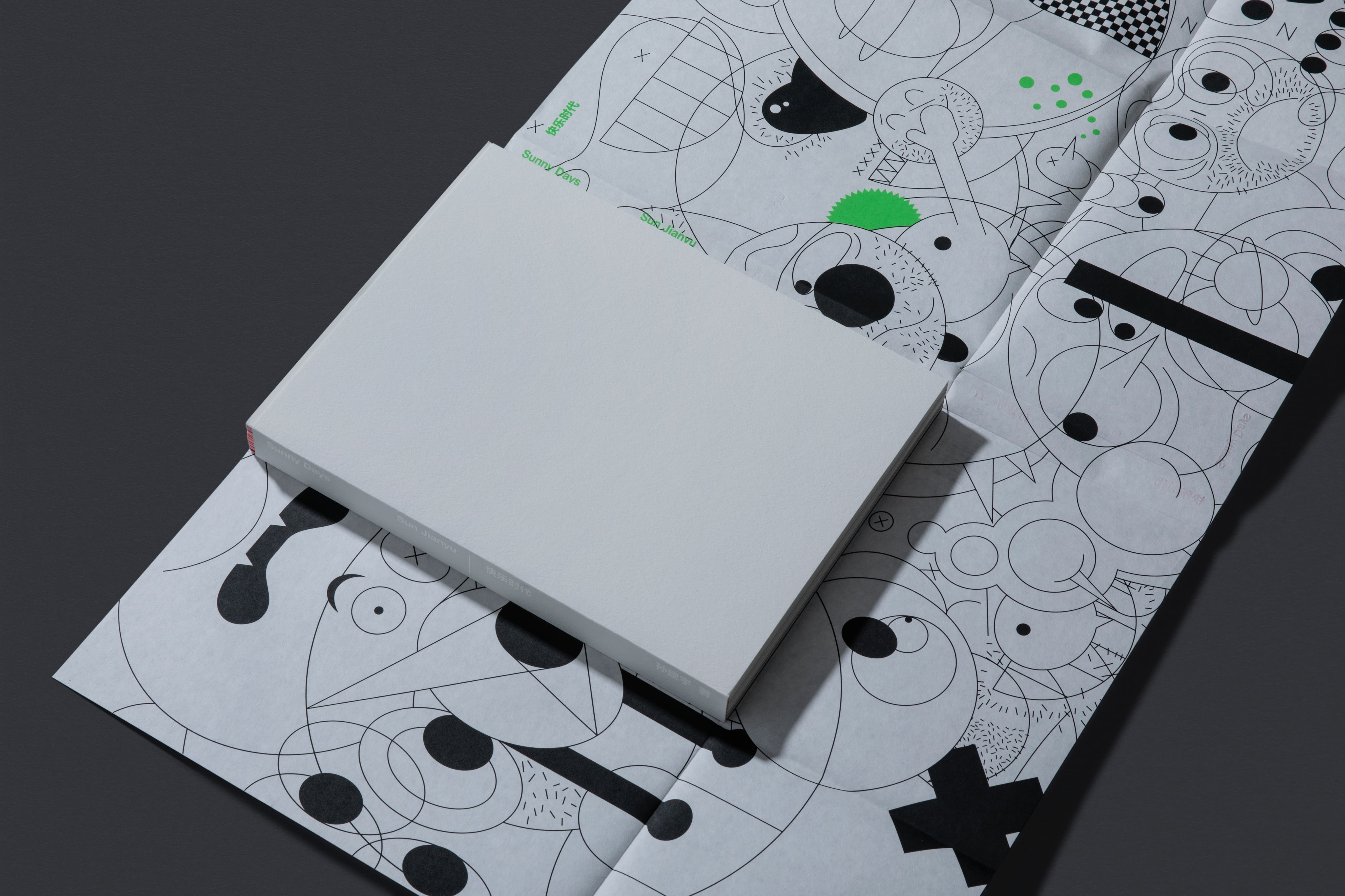
开本:237mm×313mm×30mm
重量:1845g
时间:2023年
客户:岭南美术出版社
Size: 237mm × 313mm × 30mm
Weight: 1,845g
Year: 2023
Client: Lingnan Art Publishing House
孙建宇是一名平面设计师,从事广告设计工作二十余年,在即将五十岁之际出版了这部个人作品集,这是他历年工作的回顾和阶段性总结。书中的35件作品从数百件作品中遴选而来,基本代表了作者各个时段的思考方式与表现风格。
Sun Jianyu, a graphic designer, has been engaged in advertising design for over two decades. As he is about to turn fifty, he publishes this collection as a review and wrap-up of his work over the years. Sunny Days features 35 works selected out of hundreds of pieces, which basically represent the ways of thinking and styles of expression at various stages of the author’s life.
长达六千多字的自序阐述了作者从小学习绘画直至进入广告设计行业的经历,表达了作者只有对事业、对人充满爱才能让自己真正快乐起来的生活态度。这也是把这本书取名为《快乐时代》的原因。
The over 6000-word preface tells the author’s story from the study of painting in his childhood to his career in advertising design. The author expresses his life attitude that only the love for his career and people around him can make him truly happy. That is why this collection is titled “Sunny Days.”
从内容出发,选择合适的材料进行表现并找到合理的逻辑进行编排,是设计《快乐时代》这本书时思考的问题。
On the basis of the content, choosing the right materials to present and finding the rationale to design layout were the two things the designer thought about the most when designing the book Sunny Days.
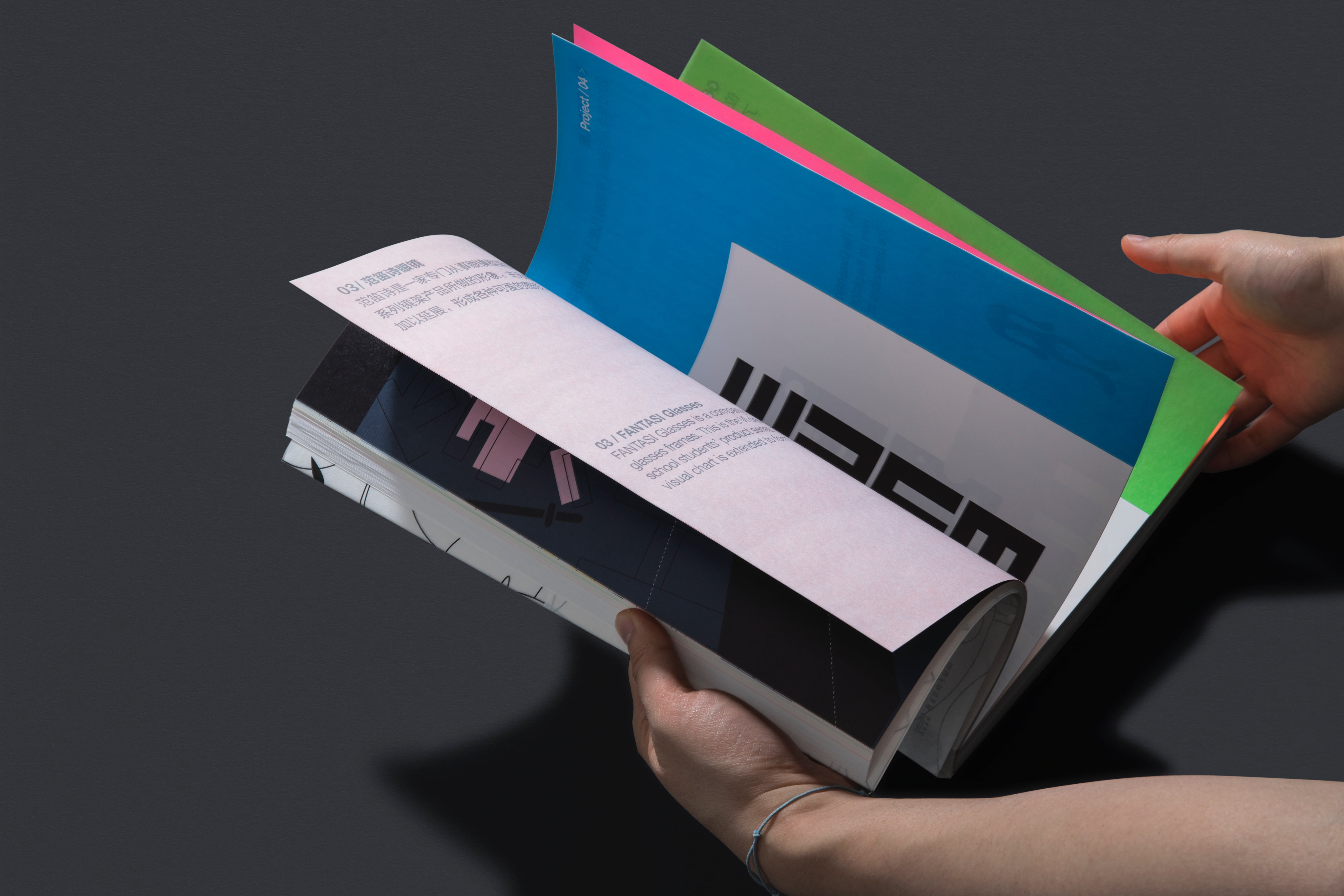
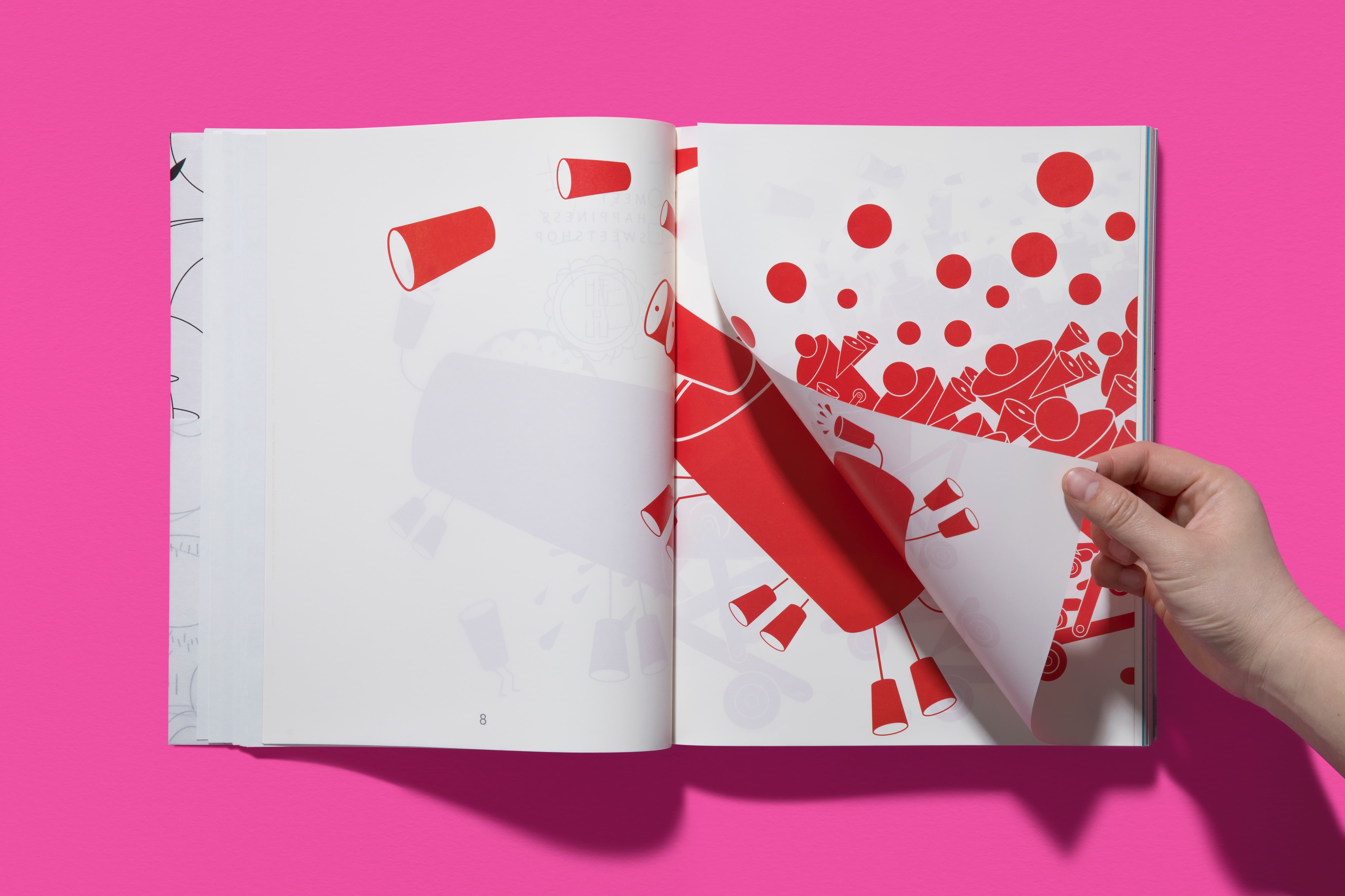
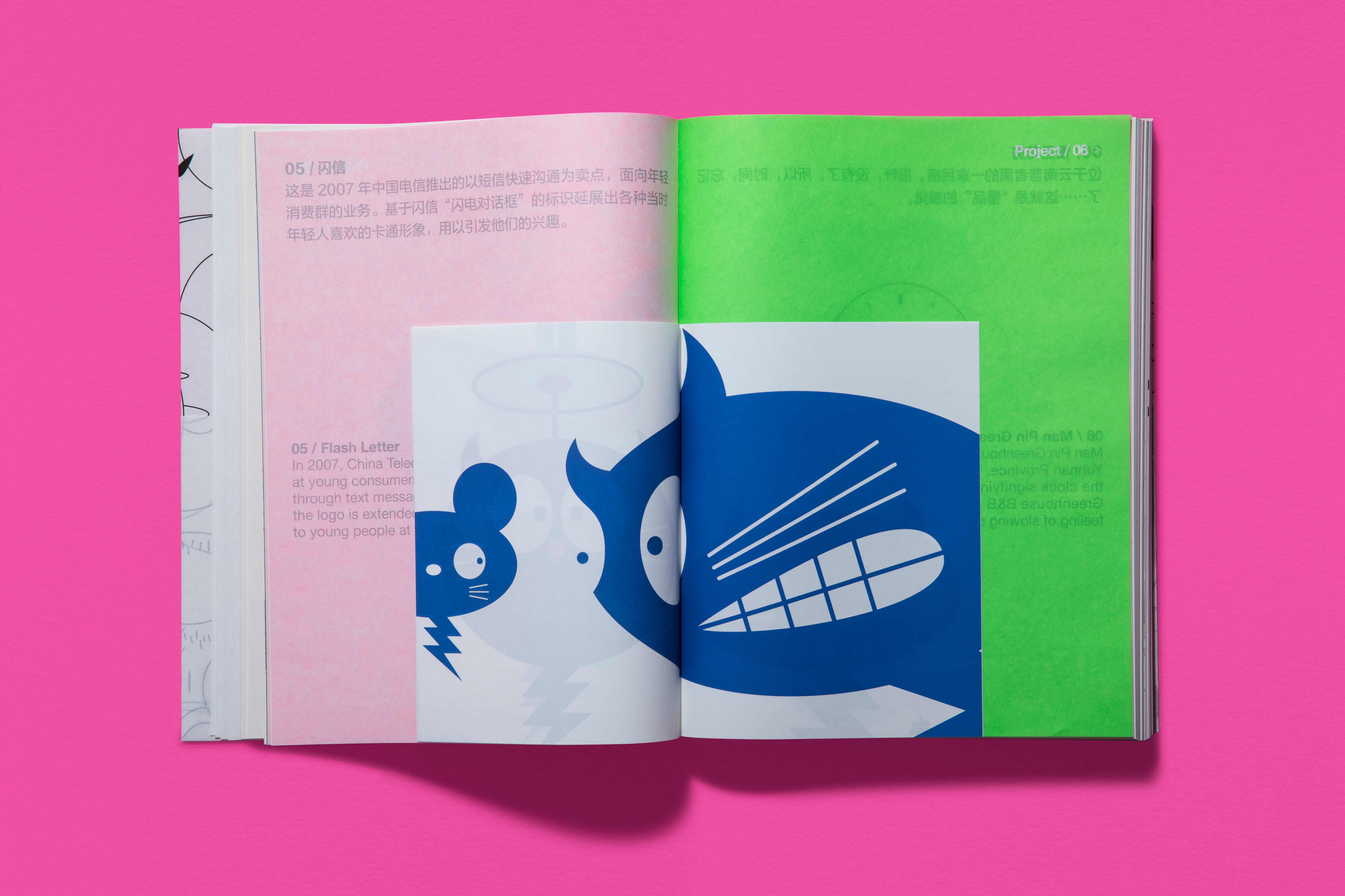
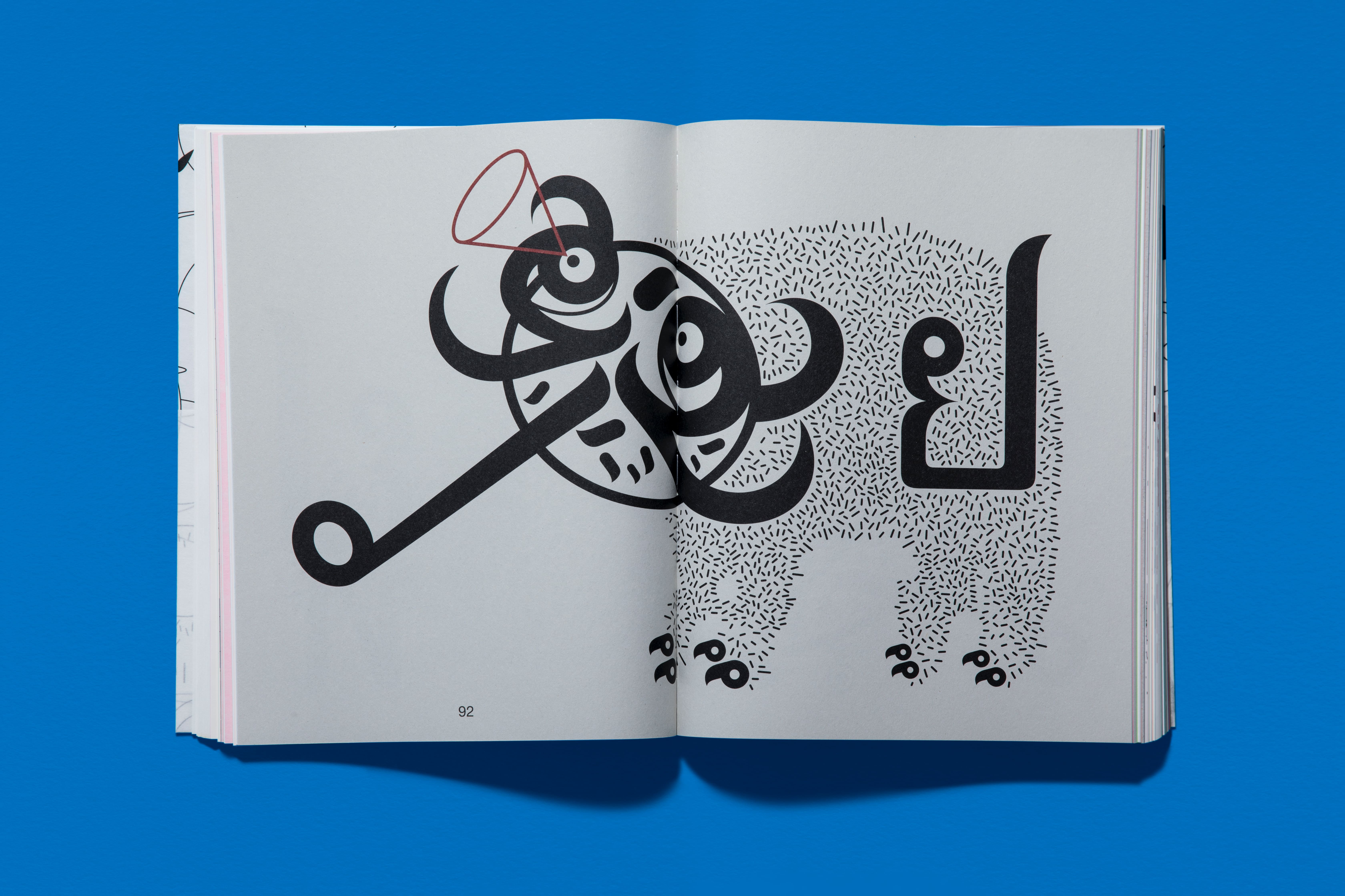
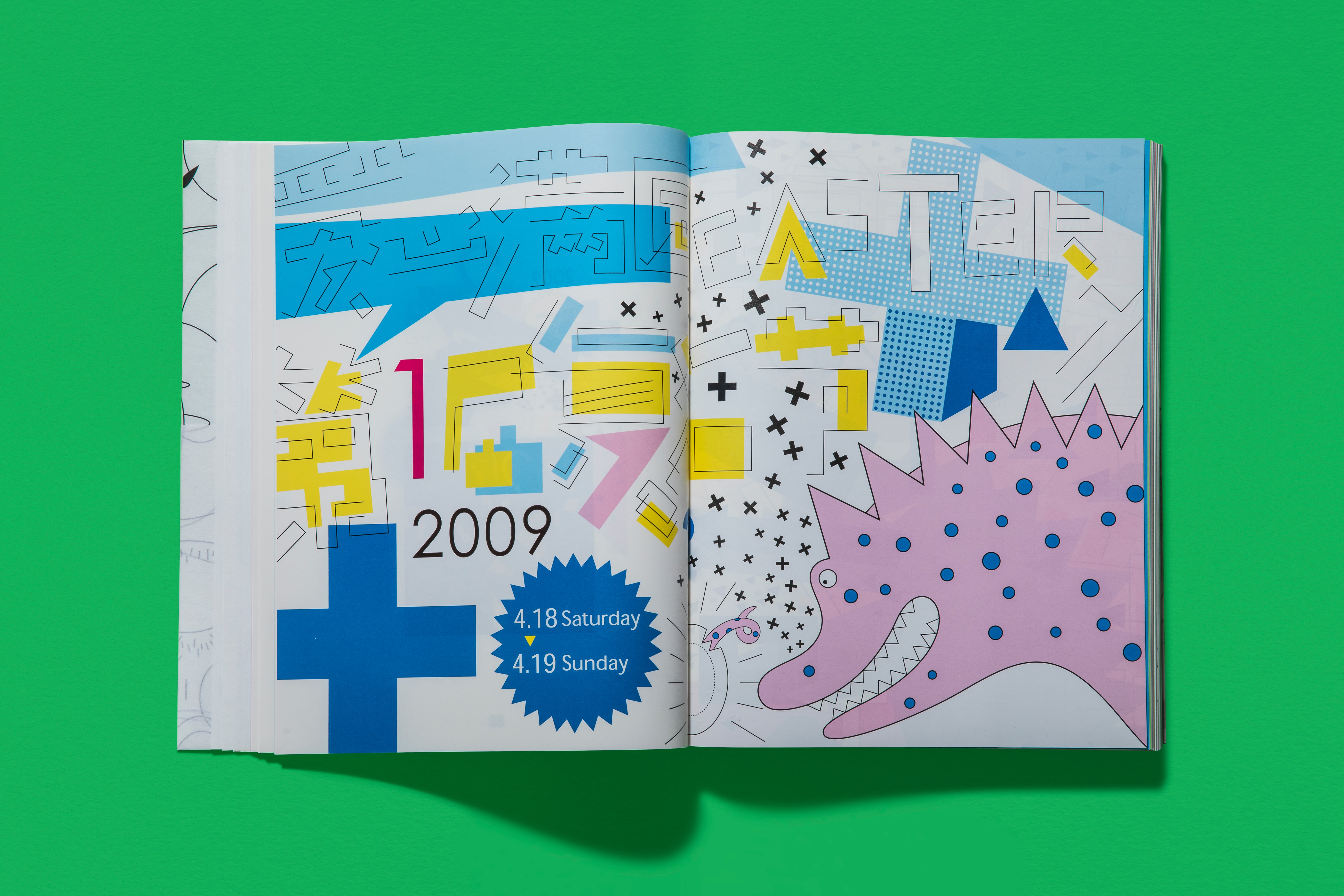
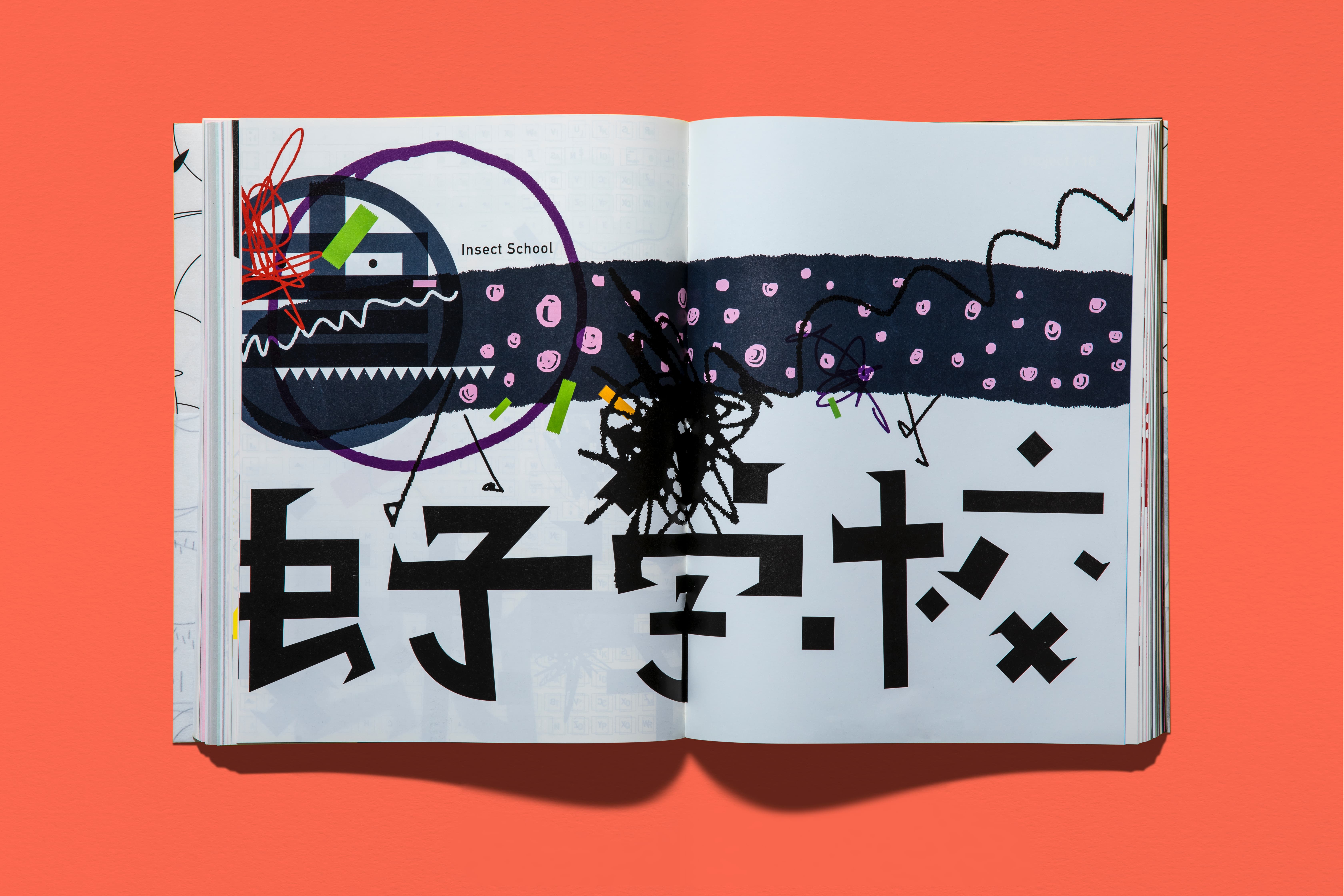
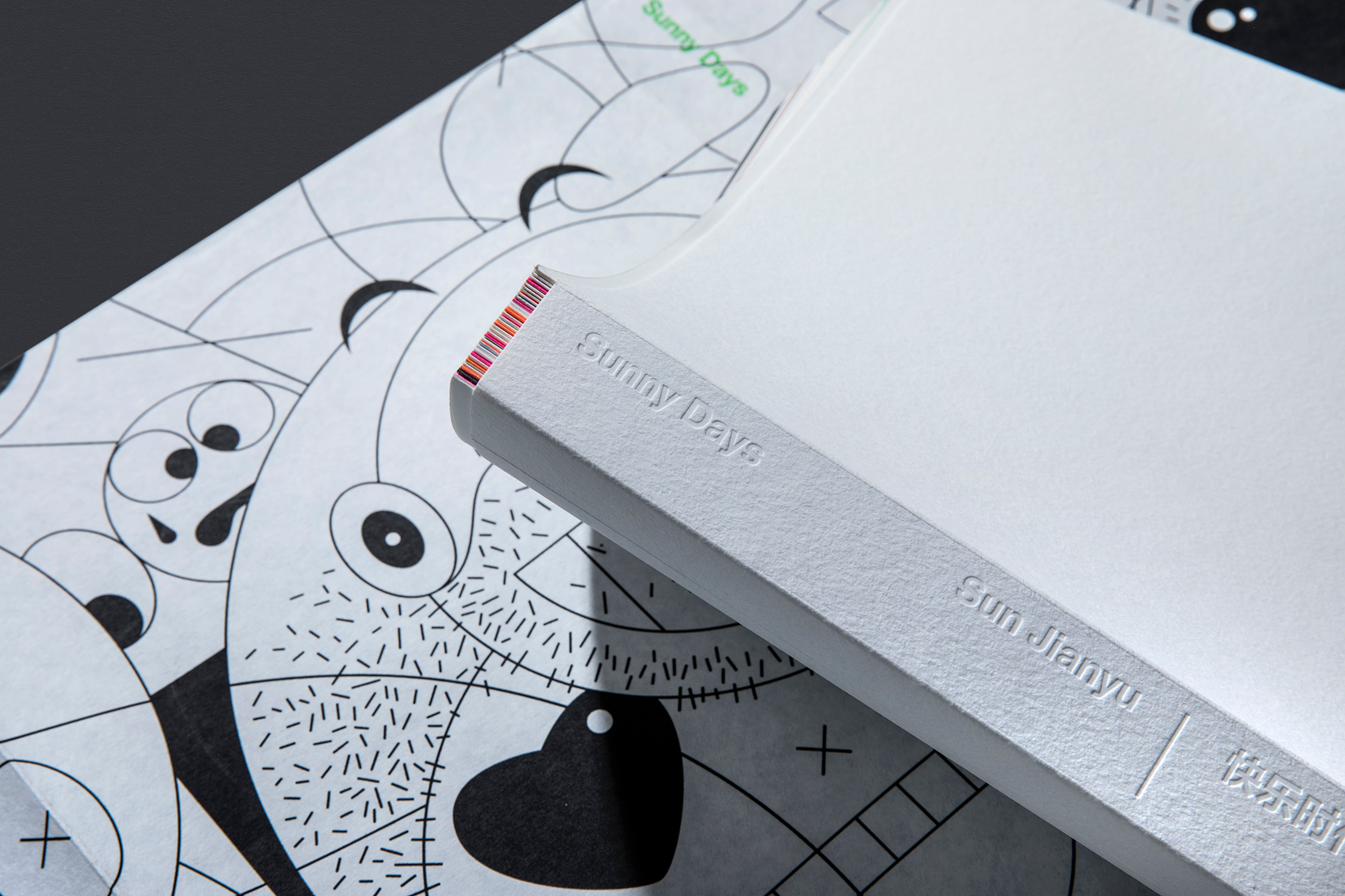
书中收录的作品内容迥异,体量不一,前期对每一件作品的梳理至关重要,只有详尽地梳理过后才能找到最适合作品的编排顺序及呈现方式。当我把每一个项目作为独立单元思考后,决定对不同的作品采用不同纸张、专色印刷、大小书页等方式还原并提升作品的质感。尊重材料的本质并结合对作品内容的理解,让它在书里扮演理想的角色是我一直以来对书籍设计的探索。
The works collected in the book vary greatly in content and size. It was crucial for the designer to meticulously edit and organize each piece during the preliminary phase to ascertain its most appropriate presentation within the book. When I considered each project as an individual unit, I discerned multiple possibilities, leading to the decision that each piece of work uses exclusive paper, color and page size, which restore and improve the quality of the works. The respect for the nature of materials and the understanding of the book content, letting these two play an ideal role in the book is what I have been pursuing in book design.
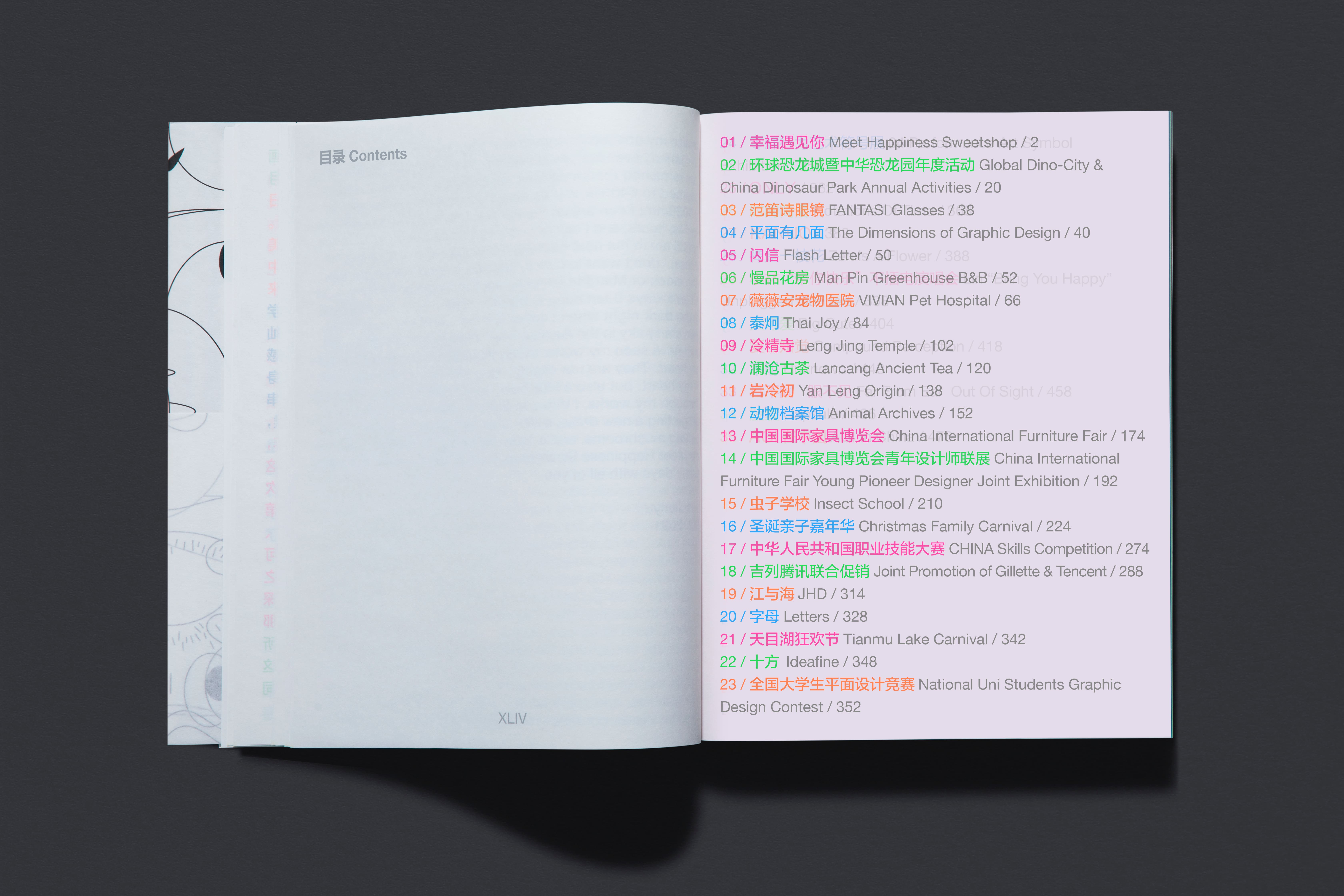
从书名到内页文字只选了2款字体(中文:方正兰亭准黑,西文:Helvetica Neue)、1个字号(21pt)进行排版设计。序言文字和作品介绍页分别用5套荧光色印刷。
营造快乐的氛围、传递快乐的情绪是这本书希望带给读者的阅读体验。
For the fonts, from the book’s title on the cover to the internal text, only two font types were selected—FZLanTingHei-L-GBK for Chinese and Helvetica Neue for English, laid out in a single font size of 21pt. The text of preface and introduction of works are 5 spot-color printed. Creating and conveying a joyful feeling to readers has been a consistent objective in the design process.
